March 28, 2017
4 Website Design Trends in 2017
-p-500.avif)
Brand Differentiation

Your website is one of your most important marketing assets. It's the face of your company, and often your customers first point of interaction with your brand. Your website better look great.
Design trends play a big part in defining whether your website is current or out of date. You're making a first impression. Here are 4 website design trends for 2017.
1. Semi-Flat Design
Google's influence on website design is profound. In 2014 Google introduced Material Design, a design standard for Google and Android products. The design emphasizes flat 2D images that use sharp angles and bold colors to demonstrate space and motion.

Google's design system was picked up extensively by graphic designers in 2015 and 2016, and we saw an explosion of flat illustrations and designs. You can see the influence in Salesforce.com Trailhead. The Trailhead illustrations are simple, flat, and colorful.
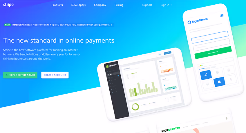
In 2017 flat design is still in, but designers are adding a touch of sophistication with shading and graphics. The addition of light shading and 3D elements adds complexity, while retaining the boldness of Material Design. Stripe is a good example of a firm that is using semi-flat design to make simple illustrations pop.
2. Custom Graphics and Illustrations

Building upon the semi-flat design trend, brands are standing out with custom graphics. This isn't to say that stock photography is dead. It's not. But with custom graphics you can create a website and brand identity that is uniquely yours.

Slack is definitely a brand to watch with its custom illustrations. They are experimenting with multiple illustration styles to bring the brand alive.
Webflow is another brand using custom illustrations effectively. The company is using very simple geometric designs to demonstrate the "building blocks" of web development.
3. Color Transitions

Color transitions are hot in 2017. A fade adds a touch of sophistication.
Uberflip launched its new website in early March. The design emphasizes a pink to purple gradient. It's also interesting to note, Uberflip uses semi-flat illustrations throughout the site.
The trend towards color transitions began in 2016 with Instragram's logo update. Instagram went from the cartoonish camera to a flatter designer with a gradient.

4. Bright, Bold Colors

Bright colors are in style for 2017. This is exciting. Bold colors are fun and add energy to your brand.Asana has one of the brightest websites. The site is like a color wheel. Each section uses a different color, and they are all electric.
As you look at all the brands listed above, you will see the bold use of colors. Slack, Stripe, and Uberflip are not afraid to engage your eye.
Make It Your Own
Website design trends are fickle. What looks amazing today can quickly look out of date. The key is to continually evolve.
Pick and choose the trends that fit your brand and the stories you're telling. There's no rule that says you have to use all or any of these trends. Rather, it's your job to create a visually compelling experience that makes your brand relevant.
Your website is the face of your company. Use the website design trends to keep it current and fresh.
Related Articles


subscribe
to our

.png)
newsletter
Get weekly email with ideas, stories, and best practices to grow a Sticky Brand!

Let's Chat
A Sticky Brand is the fastest and most effective way to grow your business. When your clients know your brand, like it, and trust it — they will choose you first! We’ll show you how!