August 6, 2015
Make Your Brand Iconic: The Power of Symbols in Branding
-p-500.avif)
Brand Differentiation

I am starting to get back into the work groove following my eye surgery. My vision isn't back to normal. It appears my left eye was overcorrected, which means it's slightly out of focus.
Most things are clear. I can drive, watch TV, and I am getting back to the gym. But I find myself covering my left eye to read. (Should I add “pirate” to my resume?)
As a result, I am finding myself drawn to pictures over words. This slight shift in perspective is making me see just how prolific and important symbols are to brand communications.
For example, when I look at my iPhone I don't need to see the words. The icons tell the story.

On my home screen, I have my most used apps. Each app is represented by a small symbol — an icon. Mailchimp has Freddie the monkey. Twitter is represented by a singing bird. Facebook uses its stylized F, and Instagram has a retro looking camera.
Without any words we know what these symbols represent, what they mean, and where they fit in our lives. They help us navigate the world — especially online.
Symbols are a powerful element of your brand identity system that extend beyond your logo. The goal of brand builders is to create a visual shorthand using symbols to connect and engage your customers.
The Roots of Symbolism in Brands and Logos
Symbols are as old as humans. They're even older than the written word.
Symbols primarily originated with established religions: the cross, the Star of David, and the laughing Buddha. These symbols are markers. They help people demonstrate their beliefs, find like-minded people, and identify specific people and things. Dan Redding writes, "We perceive, understand, and negotiate the world around us by investing meaning in all manner of signs and symbols."
Over the past 150 or so years, symbols have become far more prolific. They've extended beyond religions and movements, and they've been adopted as a primary communication device of brands.
With the rise of the industrial era companies gravitated towards using logos, mascots, and symbols to differentiate their brands. Naomi Klein writes in No Logo, "In the 1880s, corporate logos were introduced to mass-produced products like Campbell's Soup, H.J. Heinz pickles, and Quaker Oats cereal."
The logos were designed to evoke familiarity and connection and to replace shopkeepers and grocers from being the primary interface between products and consumers. The logo was a symbol to signal to consumers a certain level of quality, experience, and trust.
This concept has only grown. From the 1960s onwards, logos and symbols of brands have shifted from packaging to pop culture. The brands you use, wear and display all tell little stories. They help you express your personality and beliefs, and they help others identify with you.
This creates an opportunity for brands and logos they choose. We live in a world of choice, options, and information. There's no shortage of products to select. To stand out and connect with customers you need to draw on a very old and very well-established tool, symbols, to effectively connect with your customers.
A Visual Shorthand in Brand Storytelling
Symbols provide a visual shorthand that makes them valuable communication devices in brand storytelling.
As people interact with a symbol — whether brand, religious, or otherwise — it gets packed with meaning. It becomes a heuristic of what's to come. When you see a person wearing a white jacket and a stethoscope you think they're a doctor. The white jacket and stethoscope are the symbols of the profession, and when combined we naturally assume the person wearing them must be some kind of doctor.
We look to symbols as a visual shorthand to communicate our thoughts and beliefs. "They are mini-billboards of our thoughts, feelings, emotions, and values," writes Joe DePaola. "They serve a shorthand method of communicating at a glance something which could take several sentences, pages or books to explain in words."
With my vision being out of sorts I don't want to look at tiny print. I gravitate towards brands that can clearly convey their value proposition and utility without study.

McDonald's has applied this principle effectively for decades with the Golden Arches. The arches are positioned to be clearly visible to passing motorists. It's a sign to drivers that there is a comfortable place to rest and have a meal.
The prominence of the Golden Arches makes it a powerful symbol for the McDonald's brand. The symbol is packed with both personal and cultural meanings, and it quickly conveys a story about each McDonald's location.
This leads to an interesting branding challenge. How can you create a symbol like the Golden Arches for your brand? The arches stand on their own. They don't need a tagline or explanation. You know instantly what they are and what they represent. Can you create a similar visual shorthand for your brand?
Symbols Go Beyond Brands and Logos
The most common symbol a company develops is its logo. But let's push beyond the brands and logos.
Logos can function as a symbol, but most logos are not designed to fit that purpose. Logos are crafted to present the company name in an attractive, functional way. Symbols, on the other hand, are mini-billboards. Their job is to connect the tribe and convey meaning.
A great example of modern brands developing symbols is in the app market for mobile devices. A mobile device has limited room to convey information. As a result, app makers have embraced icons to represent their brands:

The icon is the modern-day symbol for most brands. It's small yet functional. Icons have to be clear at 32x32 pixels, which is a box of less than half an inch. Try cramming your logo into such a small space and see how good it looks.
Facebook's logo is its wordmark, but most people identify the product by its F icon. Twitter's icon plays on its metaphor of a singing bird. These icons are deliberately designed to function as symbols versus logos. They're containers of what the brand represents, as well as navigation devices of how to use them.
Manage Your Symbols, Brands and Logos
Any company (and I would argue almost every company), has an opportunity to develop brand symbols. Some symbols will be digital assets like icons, and others may be physical symbols like the Coca-Cola bottle.
The hourglass lines of the Coca-Cola bottle are one of the most famous shapes in the world. And it was deliberately designed that way.
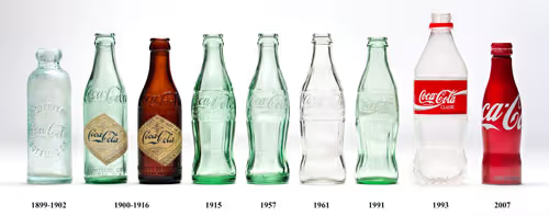
In the early 1900's Coca-Cola was already a powerful brand with a distinctive logo, but the company was concerned the logo was not enough. At the time the soda was packaged in a standard straight bottle that was either brown or clear.
According to Ted Ryan, the company wanted to protect its business by developing more symbols that would resonate with consumers. In 1914, Harold Hirsch, the lead attorney for the Coca-Cola Company, made an impassioned plea to his company to change its bottle. He said, "We are not building Coca-Cola alone for today. We are building Coca-Cola forever, and it is our hope that Coca-Cola will remain the National drink to the end of time."

Coca-Cola took deliberate steps to convert its bottle into a symbol. To create a brand that would last through the generations the company developed a design challenge: create a "bottle so distinct that you would recognize if by feel in the dark or lying broken on the ground."
The result is the Coca-Cola bottle that we all know and recognize.
Coca-Cola's desire to express its brand led to the development of a powerful symbol. It's a shape packed with meaning and history, and one we immediately associate with the Coca-Cola brand.
Pack Meaning into your Brand
The Coke bottle story is a classic one, but the lesson is relevant for almost every brand. Coca-Cola recognized it couldn't defend and grow its brand on a logo alone. They needed tangible symbols that embodied the brand. And you can do this too.
What areas of your brand can you distill and express through a simple visual shorthand?
The key to developing your symbols, brands and logos is to focus on function. Coke challenged itself to create a bottle that was recognizable "by feel in the dark or lying broken on the ground." The company's focus on function led to an iconic design.
Douglas Atkins states in The Culting of Brands, "There are also dangers in creating a symbolic system that is, well, symbolic of nothing. Aesthetics are not enough. Icons are only icons because they communicate a world of meaning to the community that honors them."
Developing symbols for your brand are deliberate, and they take many forms. Symbols can be navigational tools like Twitter and Facebook icons. Symbols be a differentiator like the Coca-Cola bottle. Symbols can be status symbols like Apple, Versace's Medusa, and Ferrari's prancing horse.

This is where I see a big shift from developing logos and symbols. A logo can simply be a thing you put on your website and business cards. A symbol is something you create to convey meaning.
Social media icons are used to convey connection: "Like us on Facebook" or "Follow us on Twitter." These platforms use their icons to help people and tribes connect with one another.
To create symbols for your brand start with a key customer touch point. Coca-Cola, for example, focused on its bottle because it was the direct point of contact between the consumer and the product. What is the most visible or prominent customer touch point with your products and services? This is a good starting point. Challenge your team to develop a visual shorthand that not only conveys meaning but enhances the customer experience.
The T-Shirt Test
It's often discussed that the epitome of branding is making your brand "tattoo worthy." This is when you connect with your customers at such a deep, personal level they are willing to ink your brand on their skin.
I am not holding symbols up to the same standard. Instead, make your symbols "t-shirt worthy."
We live in a very branded society. You're more likely to see a branded t-shirt than a blank one. Naomi Klein says, "Logos have grown so dominant that they have essentially transformed the clothing on which they appear into empty carriers for the brands they represent."
I don't consider this a bad thing. The logos we display on our clothing represent our values, beliefs, and connections. They signal which tribe you belong to.

Foursquare, the local search and discovery app, uses t-shirts to promote the brand. Users like Baratunde Thurston proudly wear "mayor" t-shirts. To an outsider, this might not mean much, but to people who use the app, it's a symbol.
In Foursquare you become mayor of a location, like a restaurant or coffee shop, by checking in more than anyone else. When you achieve the mayor status Foursquare rewards you with a crown badge. And depending on the location, these crown badges can be highly coveted.
The mayor t-shirts extend the digital realm of the Foursquare app to the real world. This helps the brand grow awareness, engage its users, and build loyalty.Creating a symbol that works on a t-shirt is easier said than done. Most logos look terrible on a t-shirt. Walk around any trade show and ask yourself, "Would I wear these logo'd golf shirts in public?"
For a symbol to work on a t-shirt it has to adhere to three qualities:
- Simple: Simple images do better than complex ones. The Foursquare mayor symbol is identifiable as an icon or a large graphic on a t-shirt. The simplicity of the image allows it to be widely recognizable.
- Connective: A symbol is more than a graphic. It has to be packed with meaning. Foursquare uses the mayor crown as a symbol because that's a badge people strive to acquire in the app. Use images that are packed with meaning and resonate with your tribe.
- Attractive: This may be obvious, but it can't be overstated. Iconic symbols like the Apple logo or the Coca-Cola bottle have a powerful aesthetic quality. They are well-balanced, well designed, and something people are proud to wear. Iconic symbols are beautiful.
If you can create a symbol that works on a t-shirt, that's a pretty good sign it will work almost everywhere. And if you do create a symbol that is t-shirt worthy, then by all means print a bunch of t-shirts to give away. Get your customers to wear your brand.
Symbols Build Brand Equity
Every iconic brands and logos have symbols because they enhance the economic value of the respective corporation.
David Aaker writes in Managing Brand Equity, "The reality is that most firms and products are fairly similar; the differences that do exist, such as service quality, are difficult to communicate in an effective and credible manner. When products and services are difficult to differentiate, a symbol can be the central element of brand equity, the key to differentiating the characteristics of the brand. The symbol can by itself create awareness, associations, and a liking or feelings which in turn can affect loyalty and perceived quality."
The symbol isn't an artistic expression of the brand. It's an emotive communication device that's been used since the dawn of mankind. And it's one of your most effective devices to stand out in a highly competitive, information-rich marketplace.
A great product with a strong value proposition may not be enough. Consumers don't truly believe there is a huge difference between products. That's why we need to connect with them at a deeper level.
I'll ask it again. How are you going to visually convey your value proposition and beliefs in a short, concise way? Reach out to us, and we can help you find out.
Related Articles


subscribe
to our

.png)
newsletter
Get weekly email with ideas, stories, and best practices to grow a Sticky Brand!

Let's Chat
A Sticky Brand is the fastest and most effective way to grow your business. When your clients know your brand, like it, and trust it — they will choose you first! We’ll show you how!